The Reiki Project
The Reiki Project specializes in providing tools and materials to Reiki practitioners world-wide.
advertising
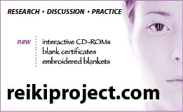
The overall design and branding emphasize the simplicity, balance, and spiritual nature of Reiki. The color palette includes cool tones amidst large areas of white space giving an impression of calm and tranquility.
 Visual imagery focuses on creating a variety of spaces conceptually linked to the ideal of a 'whole individual'. For instance, the postcard mailer (see below) uses the idea of a horizon to give depth while accentuating the vertical connection between the spiritual and the physical (heaven and earth).
The print advertisement (above) employs similar techniques while using a minimum of copy to push its message. The photograph grounds the advertisement and further supports the branding through its simplicity and tone. Created as a duotone, this ad makes use of one spot color which keeps cost down and adheres to our original publisher's specifications.
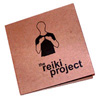
The CD-ROM case design combines many of these elements with the environmental concern of our customers - it is printed on 100% recycled kraft stock. The design reflects this choice and calls attention to the natural materials - creating a 'softer' technological product.
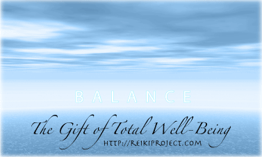
postcard mailer (front)
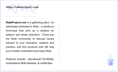
postcard mailer (back)